SEA is a modern and clean responsive Gallery Portfolio WordPress theme for creative multipurpose. It is fully customizable with a REAL LIVE builder. 30+ PreMade layouts for Agency, Freelancer, Portfolio…
[TR]
[TD] [/TD]
[/TD]
[TD] [/TD]
[/TD]
[TD] [/TD]
[/TD]
[TD] [/TD]
[/TD]
[/TR]
[/TABLE]
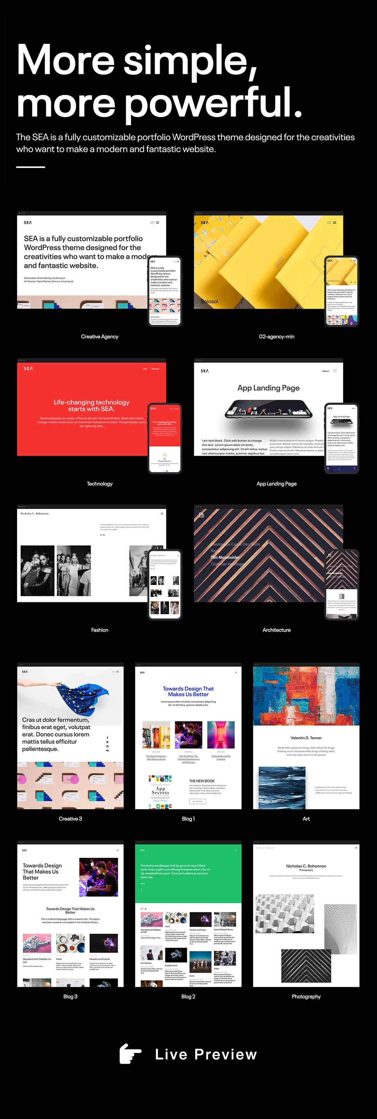
[h=3]For Designer, Photographer, Freelancer, Agency, Blogger…[/h]It is for all the creativities who want to make a difference. It will help you to showcase your creative work Gallery, Portfolio, Agency, Photography, Product Landing page, Startup, Wedding site or your Blog.
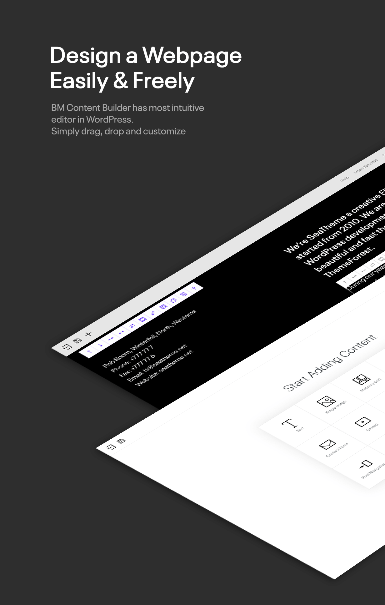
[h=3]Make Creative Thing Simple[/h]It is easy to use showcasing your work to potential clients and employers with interesting interactions. The creative BM Content Builder is a unique elements Drag & Drop LIVE mode builder(check it how to work). You can create unique webpage with no coding skills.
[h=3]Lightweight Friendly for Mobile[/h]The efficiency code will make your website loading fast. The adaptive images feature will deliver different size image depend on the visitor ’s screen size.
[h=3]Features Overview[/h]
[h=3]SHOWCASE[/h]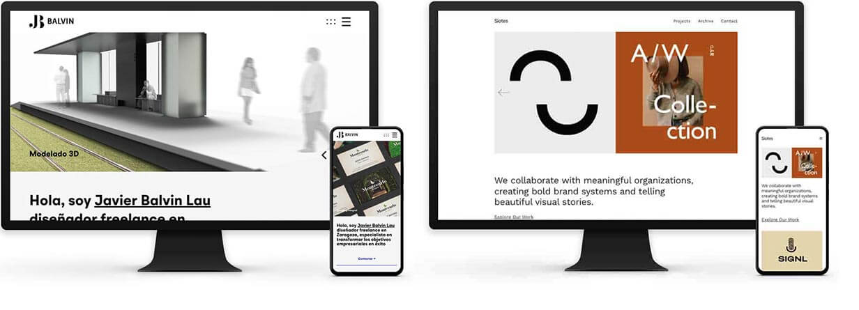 [h=3]Update Log[/h]
New Update is available (06/22/2021), WordPress 5.7.x, WooCommerce 5.3 Ready , GDPR ready[TABLE]
[TR]
[TD]
[TD]
[TD]
[TD]
[/TR]
[/TABLE]
[h=3]For Designer, Photographer, Freelancer, Agency, Blogger…[/h]It is for all the creativities who want to make a difference. It will help you to showcase your creative work Gallery, Portfolio, Agency, Photography, Product Landing page, Startup, Wedding site or your Blog.
[h=3]Make Creative Thing Simple[/h]It is easy to use showcasing your work to potential clients and employers with interesting interactions. The creative BM Content Builder is a unique elements Drag & Drop LIVE mode builder(check it how to work). You can create unique webpage with no coding skills.
[h=3]Lightweight Friendly for Mobile[/h]The efficiency code will make your website loading fast. The adaptive images feature will deliver different size image depend on the visitor ’s screen size.
[h=3]Features Overview[/h]
- 30+ clean, modern, bold, multi-purpose creative pre-made templates
- One-click-import the dozens of professionally designed demos
- Fully Responsive Layout
- Gutenberg editor ready
- The unique Drag&Drop BM Content Builder with live mode(check) and templates, you can create unlimited layouts of gallery / portfolio list and single.
- The unique BG color transitions option by scrolling
- Set fixed or fluid width for main content and header
- GDPR ready: Cookie Consent bar, Contact / Comment compatibility New!
- Select your favorite fonts and build your own web font system by Font management
4 sources included:- Google Fonts(900+)
- Adobe Fonts(1700+)
- Upload fonts: supports modern font format(woff/woff2/ttf).
- System fonts: supports web fafe fonts.
- Powerful Gallery / Portfolio list options(Standard Grid / Masonry Grid):
- Source from single posts, single portfolio, WooCommerce product, and media library
- 1-12 columns(3 cols demo, masonry demo, )
- Item spacing
- Show with items filter(demo) or without
- Unique Drag&Drag masonry editor for Masonry Grid Gallery
- Many grid ratios for Grid
- Pagination: load more button and infinite scroll
- Show text under the thumbnail, show text by mouseover, or without text
- The text style options: font, color, spacing, and alignment
- Unlimited single project(gallery) layouts by builder:
You could mix all elements including gallery, single image, heading, paragraph, slider, social icons, slider, video, and so on- 2 col layout(Gallery on left/right, filled/boxed, demo)
- Fullwidth layout(demo)
- 1-12 columns
- With slider(demo)
- Irragular(demo)
- Heading with clipped image(demo)
- Lightbox(demo)
- 12 pre-made templates by 1-click-importing
- Slider module, including dozen of options:
- What elements could be shown – title / caption / arrow / page number
- Spacing for most elements
- Text – color/font/font size/line-height/letter spacing
- Slider animation – slide/fade
- Autoplay – enable/disable, speed of autoplay
- Text position – left/center/right/bottom left/bottom center/bottom right
- Page number position – bottom left/bottom center/bottom right
- Arrow position – left and right/together on center bottom/together on rightbottom/rrrow go with cursor
- Arrow – supports SVG
- Click to open link – enable/disable
- Friendly options for Mobile:
- Most element spacing for mobile
- 3 header layouts for mobile
- Font / Icon size for mobile
- Support flexible VW unit for font size
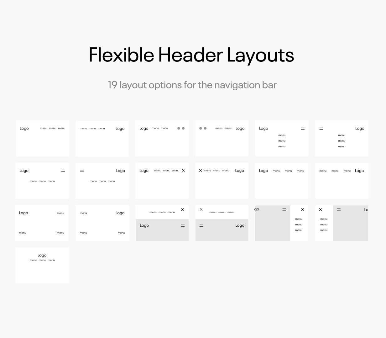
- 7 header layouts + 3 mobile header layouts.
- 7 Post Formats : Standard, Image, Gallery, Audio, Video, Link, Quote.
- Fullscreen background video, support mask text with mix-blend-mode
- Set left/right/no Sidebar for single posts
- Define unlimited colour by Powerful Theme Options
- Custom Social Media link and Share buttons
- Custom Logo – image logo / plaint text logo with google fonts
- Support plugin WooCommerce
- Support upload animated SVG icons and image
- 3 kinds of menu mouseover effect
- Awesome Lightbox: Navigate images from different modules(Demo)
- Retina Ready Design
- Adaptive images: it detects the visitor ’s screen size to deliver different size image files
- Translation ready (pot file included)
- Support the popular multi-language plugin WPML.
- RTL CSS included.
- Page loader (slide loading effect) option
- SEO Optimized – Care was taken when coding SEA and search engines will appreciate it.
- WordPress Multisite (WPMU) Tested and Approved
- Well organized, commented & clean code
- Compatible with plugin Contact Form 7
- Compatible with optimization plugin Autoptimize
- Compatible with ProfileGrid
- Child theme included
- Image Layzload enable/disable option
- Scrolled animation
- WP menu support
- WP featured thumbnail support
- WP widgets support
- Page loader transition(it is optional)
- 100% HTTPS Support
- Warmly and quickly support
- Free lifetime updates
- Fully documentation
- SEA also supports content creation by Elementor and WPBakery Page Builder. Please note the demo data are built by BM Content Builder.
[h=3]SHOWCASE[/h]
Fix the compatibility with WordPress 5.6 – Dec 9, 2020